NORSE System
Norwegian Outcome Response System Evaluation
Med Tech - Dashboard - Assessment
Disclaimer
This project is under NDA so it will only discuss my role and my design process, not the deliverables that were created for the client.
Role
UX Designer
Deliverables
Patient Assessment, Provider Dashboard, System Admin Interface, Calendar Scheduling Interface
Goal
To execute a complete redesign the legacy system for a mental health assessment used by the Norwegian healthcare system.
Status
The main UX design work has been completed for the MVP and is currently being developed by the engineering team.
Stage 1: Preparation
During this stage, I learned as much as I could about the legacy system, the stakeholder's goals for the project, and existing competitors to the Norse system. This included cross-functional collaboration with a US Stakeholder, a team of Norwegian stakeholders, the client's product manager, and my team's project manager and head of engineering. To start, I went through all of the existing data that had been collected by the client's qualitative researchers and then spearheaded an additional user research initiative to collect research in any area that had been overlooked. This research spanned three target user demographics: patients, providers, and administrators. This process included both in person or Skype qualitative interviews and surveys. To synthesize the results, I defined the pain points consistently shared, defined experience goals amongst all parties, created continua to define behavior patterns that informed my persona creation. After synthesizing all of the data, I debriefed core team on the findings of the research and gave provisional solutions to aid in objective creation and MVP planning.
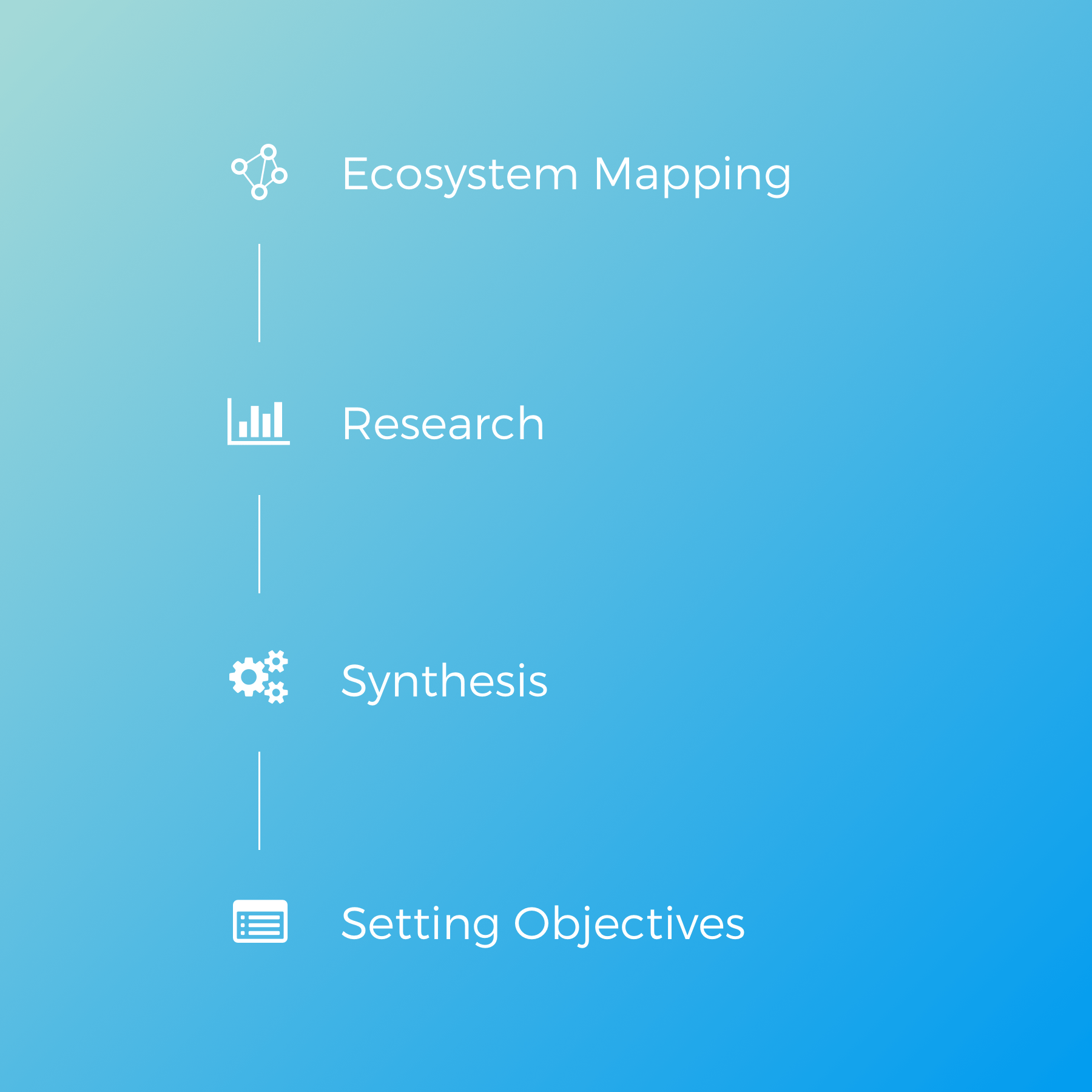
Ecosystem Mapping
Current Product Review
Future Goals
Competitive Analysis
Research
Data Inventory
Qualitative Interviews
Surveys
Synthesis
Experience Goals
Continua
Persona Creation
Pain Point Definition
Setting Objectives
Debriefing on Findings
Stakeholder Presentations
MVP Definition
Stage 2: Wireframe Feedback Loop
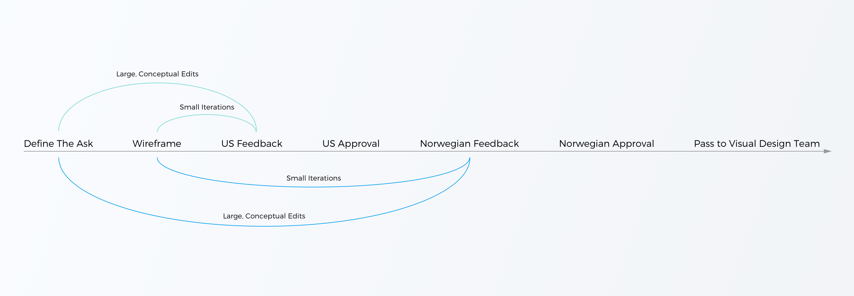
For each wireframe that was created on this project, it went through this feedback loop. There were some challenges along the way, especially between the different opinions of the two stakeholder groups, but this general system has led to everyone being on the same page at the end. During the provider dashboard, we went through about 16 distinct design directions trying to pin down the approach that made everyone happy, but ultimately it was completed and passed along to the visual design team in Norway.
Stage 3: UX Confirmation
After the visual design team goes through their feedback loop with the US and Norwegian stakeholders, the designs are then passed back to me to confirm the user experience hasn't been compromised. Once visual designs have been approved by all parties, the visual design team does a full debriefing of the designs so that I can explain both the visual design and interaction to the engineering team.

Current Stage: Engineering Implementation
I have taken over all design work, including visual design, and I'm acting as the main source of truth for anything related to the UI/UX. Hand-offs to engineering are happening in succession as new design assets are ready for maximum efficiency. Currently, we are working on the final portions for the Sys Operator view and the Calendar View for scheduling assessments.
Unique Challenges
Norwegian Aesthetic
The fact that the customer is a Norwegian client meant that I had to approach the process of creating a dashboard differently than I have with my American clients. Minimalism and an airy feel are important in Scandinavian culture, meaning I had to prioritize these aesthetic qualities over high customization or dense information access in order to achieve the user experience the Norwegian demographic is looking for.
Stakeholder Communication
Communication with the many stakeholders on this project was a unique experience. First, they are from different countries and have different opinions about how the project should be approached. Second, these stakeholders were new to the agile process, so a lot of discussions were needed to help improve the iterative process. Third, most of my communication with the Norwegian team was done through the US stakeholder, so I had to be sure I was being clear so that the message could be passed along successfully.
Patient Confidentiality
In Norway, security and confidentiality are taken very seriously. While working on this project, our team had to consult with security professionals and various government entities in order to get the level of security legally required to protect the patient information. This impacted how the application was designed and often required changes to be made to the designs as new security protocols were incorporated.
Timeline Projection
Norse 2.0 MVP was completed in August 2018.